For founders
Pricing page: three tiers, one anchor
How I lay out a pricing page so the middle tier wins without tricks: three tiers, the one you want sold visibly marked, monthly and yearly both shown, features written as outcomes, and the one question everybody has answered under the table.
Prashant Kumar Singh · · 4 min read
In short
- Three tiers. More choices means more visitors leave without choosing.
- Mark the tier you want sold, show monthly and yearly prices together, and write features as outcomes rather than checkboxes.
- Answer "what if I need more?" in one line under the table; it is the question every visitor has.
A pricing page has one job: let a visitor who already wants the product pick a plan without having to think hard. Most pricing pages fail at it in one of two ways. Too many options, so the visitor postpones the decision. Or features listed as checkboxes nobody understands, so the visitor cannot tell which plan is theirs. Here is the layout I use, element by element.
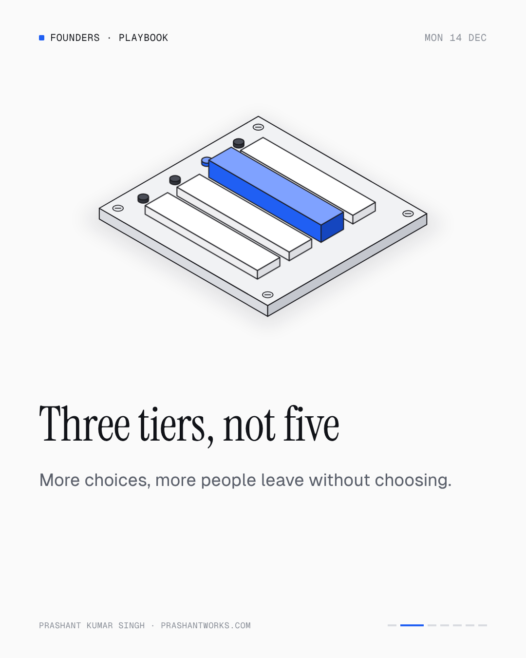
Three tiers
Not two, which leaves no middle to recommend, and not five, which turns a purchase into a research project. Three tiers map onto the three questions a visitor is asking: is there a cheap way to try this, what do most people pick, and what does the serious version cost. Name them for who they are for, not for size: "Solo", "Team", "Company" beats "Basic", "Pro", "Enterprise".
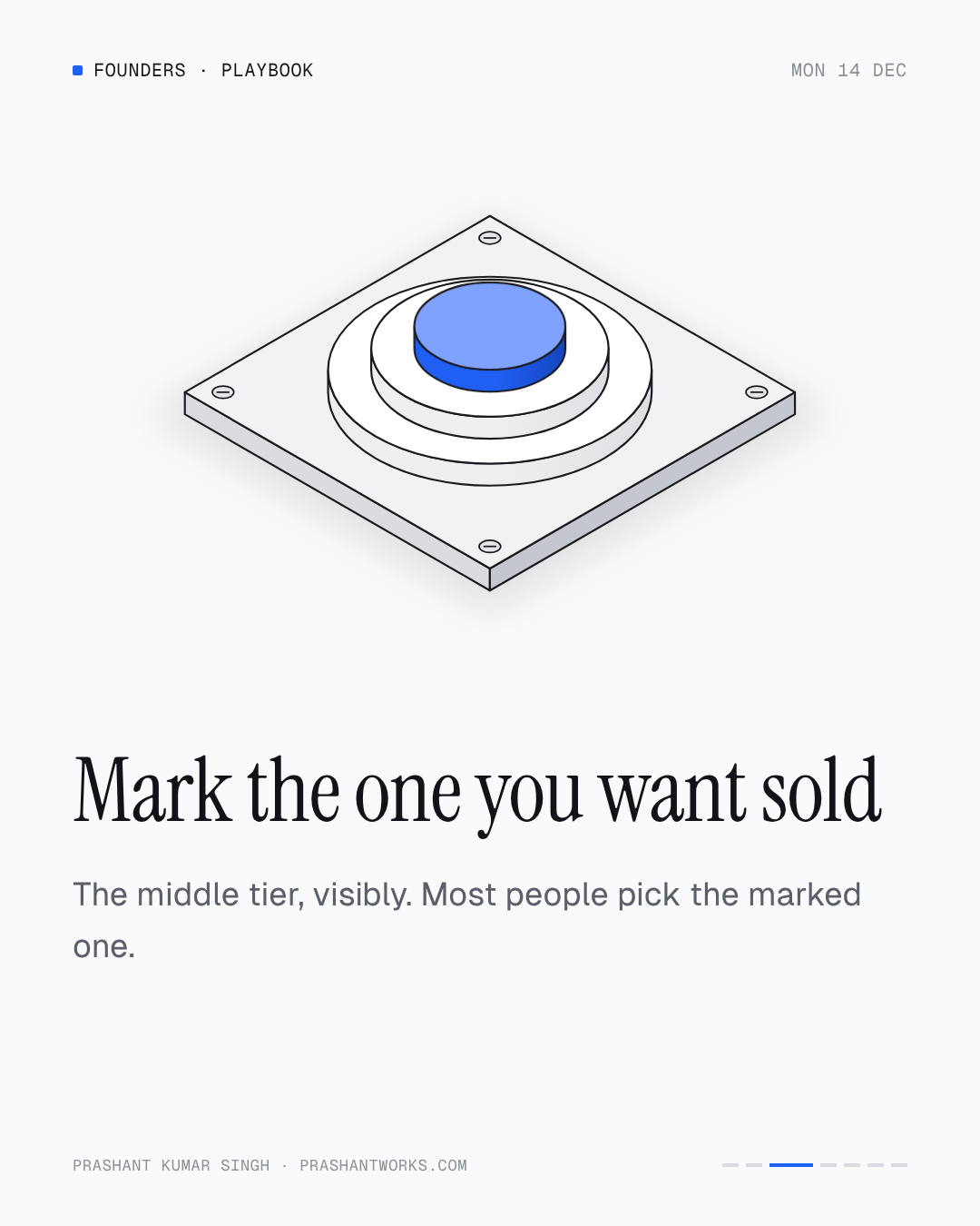
Mark the one you want sold
The middle tier is the anchor. Give it a visible mark, a border, a "Most popular" label, a slight lift, and nothing else on the page competes with it. Most visitors pick the marked option, partly because it is marked and partly because the marked option is usually the right one. That is not a trick; it is the product telling the truth about what most customers need.
Monthly and yearly, both visible
A toggle that hides one of them creates a surprise at checkout. Show the monthly price large and the yearly equivalent small beneath it, or the reverse if yearly is the default, with the saving stated in currency rather than percentage. Nobody should discover the real price on the payment screen.
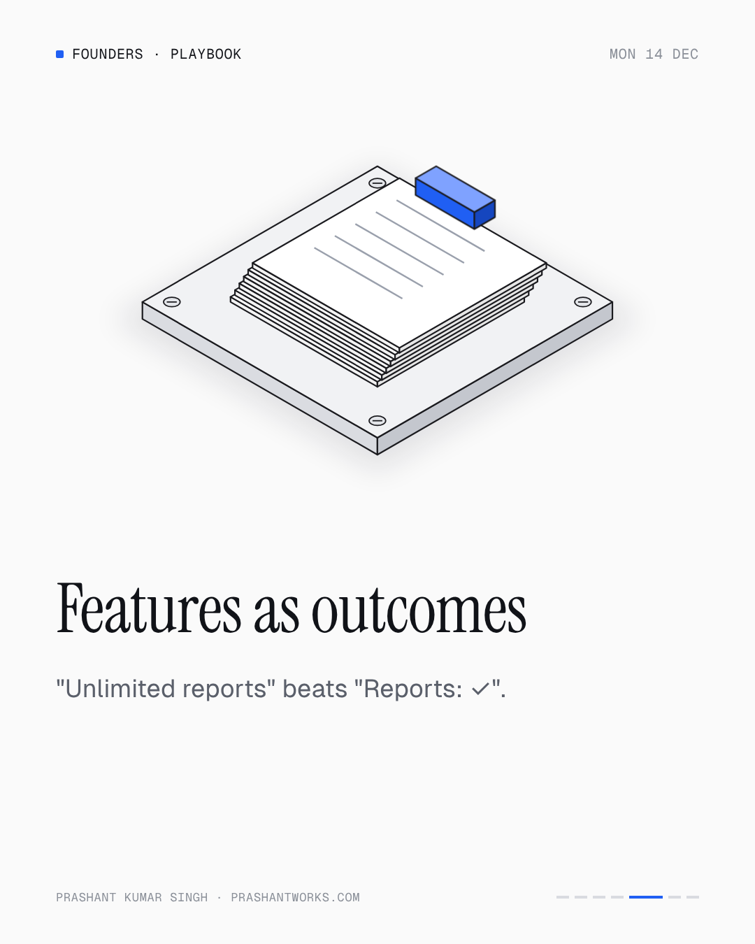
Features as outcomes
"Reports: ✓" tells the visitor nothing. "Unlimited reports, exported to PDF" tells them what they get. "API access: ✓" versus "Connect your own tools through the API". Every row in the feature list should answer "what can I do on this plan that I cannot do on the one below it". If a row is the same on every plan, it is not a differentiator and it belongs in a sentence above the table, not in the table.
Answer "what if I need more?"
Under the table, one line: what happens when a Team plan customer hits the limit. Overage pricing, an upgrade path, a "talk to us". This is the question every visitor who is seriously considering the product has, and most pricing pages make them email to ask. Answer it on the page and the serious visitors stay.
| Element | Rule |
|---|---|
| Tiers | Three, named for who they are for |
| Anchor | The middle tier, visibly marked, nothing competing |
| Price | Monthly and yearly both visible, saving in currency |
| Features | Outcomes, only the rows that differ between tiers |
| Under the table | "What if I need more?" answered in one line |
| Not on the page | Countdown timers, fake scarcity, hidden fees |
A note on the free tier
A free tier is a product decision, not a pricing-page one. If you have one, it belongs on the page as a fourth, visually smaller option, or as a line above the three tiers, not as an equal column. Its job is to let people try; the three tiers' job is to let people buy. Keeping them visually distinct keeps the decision simple.
Questions people ask
- How many pricing tiers should a SaaS have?
- Three. Two leaves no middle option to recommend; five or more turns the purchase into a research project and more visitors leave without choosing.
- Which pricing tier should be highlighted?
- The one you want most customers on, usually the middle tier. Mark it visibly and make sure nothing else on the page competes with it.
- Should a pricing page show monthly or yearly prices?
- Both, together. Hiding one behind a toggle creates a surprise at checkout. Show one large and the other beneath it, with the saving in currency.
If you're a founder
Send your pricing page link and the free teardown will come back with the tier structure, the anchor, and the rewritten feature rows.
If you run an AI lab or data team
Pricing for task work follows the same principle: by complexity, in writing, with "what if we need more" answered before the pilot starts.
Sources