Skip to content

Own product · Mobile apps · Live on the web

Strongroom

A money book for India: every account, the whole April-to-March year, on one page

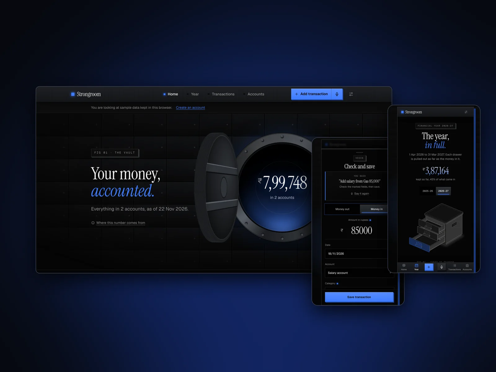
Strongroom is a personal finance app for people in India. You add your accounts, import a bank statement or just say what you spent, and see your whole financial year in one place. I designed and built it end to end: the product, the 3D vault interface, the live drawings, the voice entry, the database and the iPhone and Android apps.

Strongroom: A money book for India, with voice entry
Role
Design + development
Type
My own product
Platforms
Web, iOS, Android
Scope
Product, UX, UI design, 3D interface

01The problem

What needed solving

Most money apps are built around the calendar year and US-style statements, ask for bank logins before they show anything, and bury the one number people want under charts. In India the year runs April to March, amounts read in lakh and crore, and every bank exports a statement in a different shape. I wanted an app that answers “where did the money go this year?” in one glance, and that people trust with their numbers.

Who it’s for

  • Salaried people

    See what came in, what went out and what they kept this financial year.

  • Households

    Keep salary, cash and card accounts in one place without linking a bank login.

  • People on the move

    Log a spend in seconds on the phone, in the words they would use anyway.

02Structure

How Strongroom is organised

Everything has one home. Getting this right first keeps every screen simpler.

Home

  • The vault
  • This month
  • The year so far

Year

  • April to March
  • Came in, went out, kept
  • Categories

Transactions

  • Ledger
  • Import
  • Add by voice

Accounts

  • Safes
  • Balances
  • Settings and export

03Inside the work

The thinking, feature by feature

Each part of the product, the problem behind it and how I approached it.

Home: one number first

The vault

People open a money app to answer one question: how much do I have? Most apps answer it with a dashboard of tiles. I wanted the answer to feel like opening a safe.

How I approached it
  • The home screen is a steel vault door. The wheel turns, the door swings open in 3D and the balance counts up inside. It plays once per visit, not on every page change, so it stays a moment and never becomes a wait.
  • Under the number sits one plain sentence (“Everything in 2 accounts, as of today”) and a link that explains where the number comes from. A total you can’t trace is a total you don’t trust.
  • The vault, the safes and the buttons are all CSS and SVG, with no images, so they stay sharp on any screen and switch between the dark and light themes.

Every screen is a machine

Drawings that are the data

Charts tell people what happened, but few people read them. I wanted each screen to show the numbers as a physical thing you understand at a glance.

How I approached it
  • Each section has a live isometric figure drawn from your own numbers: a beam balance tips toward what came in or what went out this month, a pen plotter prints one bar per month of the year, a chest of drawers opens each drawer as far as the money in it, and each account is a safe as tall as its balance.
  • The figures come from my own isometric illustration engine, the same one I use for my posts, ported into the app so they redraw from real data instead of being static art.
  • Charts stay honest: bars to scale, labelled, with a “Show as table” switch. On a phone the small tags on a figure are dropped and the reading moves into a card under it, so nothing important is too small to read.

Voice entry, checked before it saves

Say it the way you’d say it

Logging a spend is the habit that makes or breaks a finance app. If it takes longer than five seconds, people stop.

How I approached it
  • A mic key sits beside Add. You say “spent 450 on Swiggy yesterday from HDFC” or “salary from Acme 85,000”, and the add form opens filled in, with the fields it filled marked.
  • Nothing is saved until you tap Save. Voice fills the form; it never writes to your ledger on its own, so a misheard number costs a tap, not a wrong balance.
  • It reads amounts in digits or words with k, lakh and crore, dates like “yesterday” or “last Monday”, the account and the category, and common Hinglish (“salary aayi 85000”). The matching happens on the device, and if the microphone is blocked you can type the same sentence.

Import and the ledger

A statement in, a year out

Every bank exports a statement differently: one amount column, separate withdrawal and deposit columns, a Dr/Cr column, lines of text above the headings. People shouldn’t have to clean a file to use an app.

How I approached it
  • You drop in the CSV from your bank’s website. The columns are recognised for you, and you check them before anything is added.
  • Lines you already imported are skipped, so importing the same file twice adds nothing, and a whole import can be undone in one step.
  • The ledger stays plain and quick: search by description, note or category, filter by month, and money in shows in green with a plus sign. On a phone the filters fold behind one button so the first transaction is on the first screen.

04Key decisions

Choices that shaped it

What I considered, what I chose, and why.

Decision 01

Spend the 3D on real objects only

A heavy 3D style makes a product memorable, but it can make everyday tasks slow and tiring.

Considered

A 3D look on every element, lists and forms included.

Chosen

3D only for things that are real objects (the vault, a safe, a button, a plate); lists, forms and tables stay flat and fast.

Why it works

People remember the vault, and they still find a transaction in a second.

Decision 02

Statements before bank logins

Linking a bank account is the fastest way to get data in, and the fastest way to lose a new user’s trust.

Considered

Bank-feed sign-in on day one.

Chosen

Start with CSV import, manual entry and voice, plus a sample-data mode that needs no account at all.

Why it works

People can see exactly what the app does with their numbers before they give it any. Bank feeds can come later, once it has earned that.

Decision 03

One codebase for web, iPhone and Android

Three separate apps would triple the work for one person and let the designs drift apart.

Considered

Native apps built separately for each platform.

Chosen

A phone-first web app that installs from the browser, wrapped with Capacitor for the iPhone and Android, with native speech, share sheet and haptics where they matter.
Why it works

One design system and one set of tests cover every platform, and the website is live while the store builds go through review.

05How it was built

Designed and built

I designed it and wrote the code, so the design survived contact with reality.

Interface

  • React
  • TypeScript
  • Tailwind CSS
  • CSS and SVG 3D

Figures

  • Isometric drawing engine
  • Live SVG from data

Data

  • Supabase Auth
  • PostgreSQL with row-level security

Apps

  • Installable web app
  • Capacitor for iPhone and Android
  • Vercel

06Outcome

What was delivered

Delivered

  • Live at strongroom.fynolabs.si, with sign-in by email or Google and a sample-data mode that needs no account.
  • iPhone and Android apps built from the same code with Capacitor, with native speech, share-sheet export and haptics.
  • 35 unit tests on the money, date, CSV and voice logic, plus 43 click-through checks of every flow in both themes.
  • 28 security checks through the public API: signed-out visitors get nothing and nobody can read another person’s rows.
  • Phone-first layout checked at 320, 360 and 390 px: 44 px touch targets, 16 px field text, reduced motion honoured.

What I learned

  1. 01

    A strong visual world makes a product memorable, but only if the boring screens stay fast.

  2. 02

    Voice entry works when it fills a form you check, not when it writes data on its own.

  3. 03

    Trust in a money app is designed: a traceable total, a sample mode and a delete button do more than any badge.

In brief

Strongroom, in five answers

What is Strongroom?

Strongroom is a personal finance app for people in India. You add your accounts, import a bank statement or just say what you spent, and see your whole financial year in one place. I designed and built it end to end: the product, the 3D vault interface, the live drawings, the voice entry, the database and the iPhone and Android apps.

What problem does Strongroom solve?

Most money apps are built around the calendar year and US-style statements, ask for bank logins before they show anything, and bury the one number people want under charts. In India the year runs April to March, amounts read in lakh and crore, and every bank exports a statement in a different shape. I wanted an app that answers “where did the money go this year?” in one glance, and that people trust with their numbers.

Who is Strongroom for?

It is built for salaried people, households and people on the move.

What did Prashant Kumar Singh do on Strongroom?

Prashant worked on it as his own product, covering product, uX, uI design, 3D interface, react, supabase and iOS and Android for Web, iOS and Android. Delivered: live at strongroom.fynolabs.si, with sign-in by email or Google and a sample-data mode that needs no account, iPhone and Android apps built from the same code with Capacitor, with native speech, share-sheet export and haptics, 35 unit tests on the money, date, CSV and voice logic, plus 43 click-through checks of every flow in both themes, 28 security checks through the public API: signed-out visitors get nothing and nobody can read another person’s rows and phone-first layout checked at 320, 360 and 390 px: 44 px touch targets, 16 px field text, reduced motion honoured.

What were the key design decisions in Strongroom?

Spend the 3D on real objects only. 3D only for things that are real objects (the vault, a safe, a button, a plate); lists, forms and tables stay flat and fast. Statements before bank logins. Start with CSV import, manual entry and voice, plus a sample-data mode that needs no account at all. One codebase for web, iPhone and Android. A phone-first web app that installs from the browser, wrapped with Capacitor for the iPhone and Android, with native speech, share sheet and haptics where they matter.

Next step

Tell me what you're building.
I'll tell you how I'd ship it.

Pick a time that suits you. You'll leave the call with a clear next step, whether we work together or not.

Book a free call

Free · 30 minutes · No commitment

Prefer email? prashantkumarsingh.work@gmail.com